simplicity=less distracting
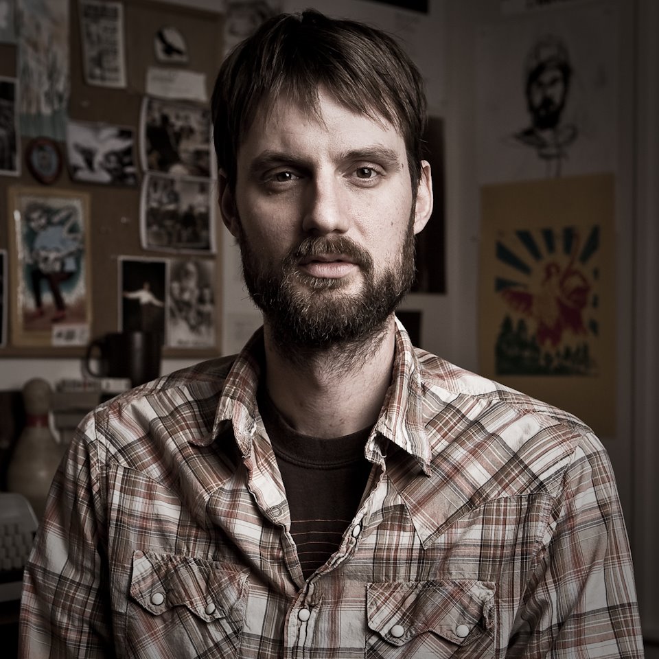
I shot again with Caleb last week for the cover of Eyes so strong and Clean. The latest concept was a collaborative effort that stemmed from some scout photo’s that we shot back in October. The original Idea was a portrait of Caleb in his workspace, a rowhouse in Remington, Baltimore. His studio is a small room off his bedroom. It’s filled with tons of books, guitars, computers more guitars, records and lots of natural light. I’m always so envious of this workspace. You can just walk in, sit down and immediately your mind starts to wander strait into your most creative places. Caleb uses two desks, one for his two ibooks and one for an old typewriter where his lyrics are made a little more permanent. I think it was my envy of this creator’s office that distracted me from our original concept. The idea of him in his workspace was great, but in the end we were trying so hard to incorporate the workspace that, we missed the point of the cover. -A strong image of Caleb that would express the emotion of the album. In the end the background was nothing but distracting from the image. After we finished the principle shooting for the day I ran around his office grabbing shots of random things for inserts in the album. The final shot of the day was of a sketch of Caleb made by Christine Sajecki. I suggested that the sketch would make a great cover to the album. After we both reviewed the images and neither of us was very excited about the images (for a cover) we revisited the idea of the sketch as a cover. Caleb admitted that it’s been in his head since I had mentioned it. I truly feel like it is exactly what we were trying to accomplish with the album cover. Somehow, without even being able to see any detail in the man’s face, you know what he is going to sing about. And it was right there in the background the whole time. I’m grateful for these jobs. I am able to shoot and learn in the most nourishing environment. In retrospect i realize that I lost sight of what we were trying to accomplish because I got distracted with other elements that interested me. I tried to incorporate something that I thought would make a more interesting photo and it ultimately distracted the viewer (to be) from the point of the photo.
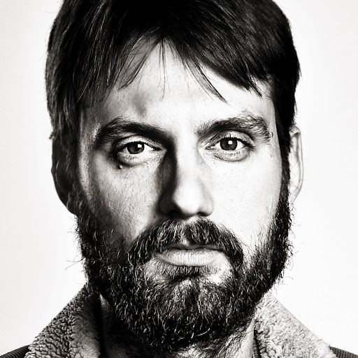
The conversation with Caleb along with studying Christine’s sketch made me think about the Avedon Show I had recently seen at the Corcoran. I’ve always been a huge fan of Avedon’s, but in this moment I think I appreciate more than ever what he was doing. With that white seamless behind him, the subject and the viewer are eye to eye. Im not saying that I would want to spend a career doing things that way but I do see the value in it. I had to revisit some of the other test shots Caleb and I took on a white seamless to see what would come of a more simplistic path. I think this is more along the lines of what we were ultimately after, (being a test shot, little attention to hair, light,wardrobe, attitude, etc) It gives you nothing to look at but the emotion and energy, and the wrinkles or the beard or the eyes in the talents face. Christine’s sketch does a better job of telling this same story b/c the simplicity of the sketch lets viewer/listener have a little input. It’s beautiful. Watch for the album soon on calebstine.com
Click on images for larger views.
